gekko / Design standard
Sumi-e Styleguide
Recognition, written in ink. A shared design standard for app icons and project signets across iOS, Apple Watch and macOS.
Version 0.4.1 / 13 September 2026 / English / A4 portrait / © 2026 gekko
Download the PDF01. Recognition, written in ink.
A style guide for Sumi-e app iconography.
Form, material and Apple system behaviour.
Familiar signs carry meaning. The hand gives each form its living character.
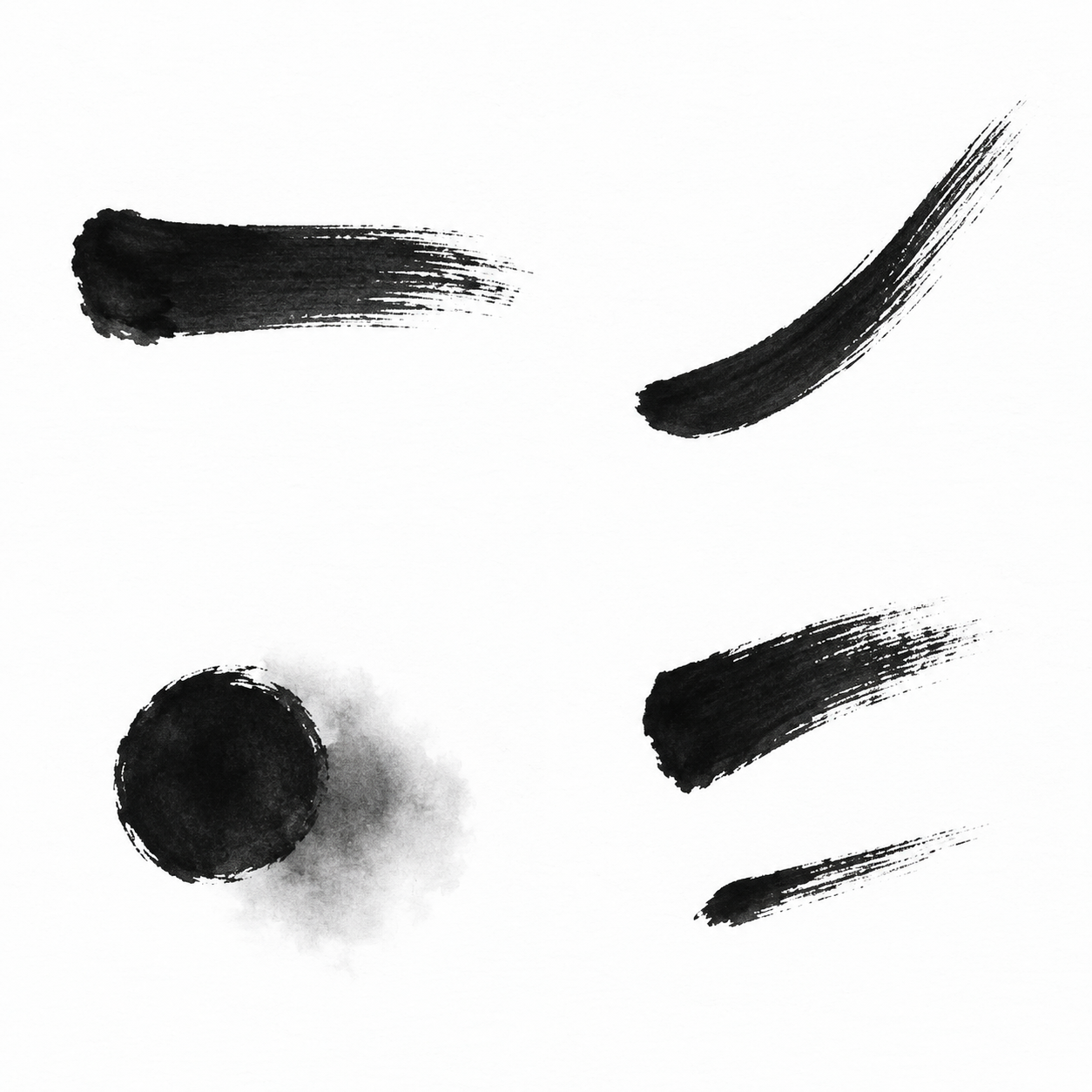
Four unassigned studies: ink body, curve, wash and interval.
Design principles, native teaching studies and project-specific revision examples. Copyright holder: gekko.Back to contents
02. A working standard
This edition records the agreed direction and makes the next design decisions reviewable.
Purpose
Create a recognisable family across fifteen projects while preserving the signs people already understand. Default artwork uses black ink and restrained grey washes on white paper.
Scope
App icons for launchers, the Dock and distribution, plus project logos where no native app target exists. Interface symbols and Watch complications remain outside this edition.
Status
Working design standard with native teaching exports and a handwriting audit of fourteen marks across twelve projects. Numeric ranges remain review starting points. Production approval, integration and device validation are separate.
Reading the rules
B = binding brief constraint. W = working design parameter. A = Apple platform guidance, checked on 11 September 2026. R-numbers remain stable between editions.
Print-edition map
- Principles, anchors, ink and tone / PDF pages 03-09
- Apple masks and appearances / PDF pages 10-12
- Liquid Glass and ink material / PDF pages 13-14
- Points, pixels and visual context / PDF pages 15-17
- Production and resolution manifest / PDF pages 18-19
- Portfolio, review and workflow / PDF pages 20-22
- Edition control, sources and revision studies / PDF pages 23-26
- Handwriting, family and decision audit / PDF pages 27-30
R12 / B: No watermarks, signatures, seals, emojis or self-referential marks in icon artwork. Avoid app names and decorative lettering; meaningful symbols such as Sigma or clock digits are permitted.Back to contents
03. Recognition sets the limit
The amount of abstraction is decided by the meaning that must survive.
Keep the semantic anchor.
Let the hand carry the form.
First: recognition
Choose whether recognition is carried by an emblem, a familiar object or a behaviour. Record essential relationships, openings and action before brush exploration. Recognition need not depend on equal sides or mirrored strokes.
Second: application identity
An ecosystem emblem establishes affiliation. The application must also express its own purpose through composition or a substantial shape relationship. A brush texture alone does not create an independent identity.
Third: family resemblance
Use related pressure, density, spacing and optical weight. Each motif keeps its own silhouette and personal brush course. The hand must remain visible in the broad shape even when fine grain disappears.
Ron Cobb
Function and plausible visual logic.
Paul Rand
A concise, memorable central idea.
Otl Aicher
Consistent visual relationships; no obligation to ruler-perfect contours.
Susan Kare
Clarity under severe size constraints.
R01-R03, R18-R19 / B. Recognition may reside in an emblem, an object or a behaviour. The four influences are project interpretations, not quotations or reproductions of their work.Back to contents
04. Three kinds of visual anchor
Establish what the audience recognises before selecting the degree of freedom.
Emblem / Sigma and octagon

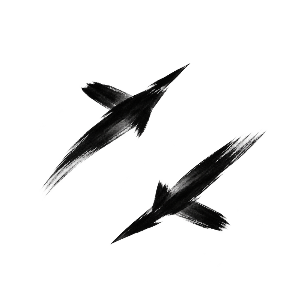
Object / DF-02
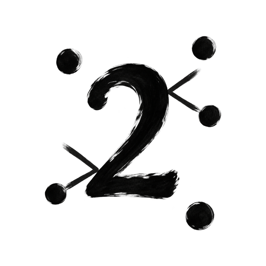
Behaviour / GD-05
Emblem
Retain the identifying relationship when an established sign is quoted. An Ergo association may use the Sigma and eight-sided geometry; a project identity must also communicate its own role.
Object
Retain only the object features needed for recognition. Dogfight needs direction and a wing-axis cue. Cockpits, weapon details and specific aircraft anatomy exceed the required information.
Behaviour
Make the defining interaction visible. GravityDigits needs particles meeting and changing direction at numeral boundaries. Irregular spacing suggests disorder; contact and deflection show the mechanism.
- Name the anchor: emblem, object or behaviour.
- List the minimum features that carry its meaning.
- Identify the application-specific operation or relationship.
- Record the nearest likely confusion and the small-size test.
R01, R18-R19 / B. Left: schematic ecosystem emblem, not an official master. Centre and right: R2 project studies DF-02 and GD-05 (F14), awaiting selection. See page 25 for the full comparison.Back to contents
05. A stroke has structure
Pressure, direction and lifting shape the whole stroke, from its dark body to its drying edge.
Four unassigned studies: ink body, curve, wash and interval.
01 / Body
Loading, contact and lift make the body itself swell and narrow. Its readable core should survive when fine dry fibres disappear.
02 / Curve
A change of direction and pressure creates the curve. Keep a continuous dark core; do not draw a rigid contour and add distress as a separate effect.
03 / Wash
A compact mark holds the meaning. The adjacent grey wash contributes atmosphere and may disappear without changing identity.
04 / Interval
Two gestures are separated by active white space. Their relationship must survive scaling and system treatment.
R04 / W: Begin with two to four dominant gestures; an emblem may require more. R07 / B: Fine texture is secondary. The visible grain in this study is a material reference, not a mandatory icon background.Back to contents
06. Give the white space a job
Openings, margins and intervals are designed with the same care as the ink.
Square construction grid and circular clipping test
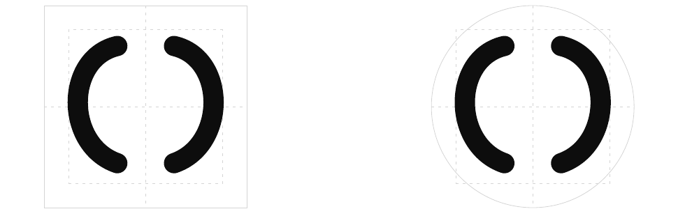
A proportional study grid
Use a 100-unit square to discuss placement. Begin with about 12 units of inset, then adjust optical scale for each motif and platform mask. The grid positions the sign; it does not dictate the brush path. This is a studio starting point, not an Apple safe-area specification.
Critical openings
As an initial test at 32 pixels, allow roughly 2 pixels for a critical gap or stroke body: 6.25 units on a 100-unit grid. Inspect the raster result; this calculation does not guarantee legibility at 16 pixels.
Optical balance
A diagonal gesture can extend farther than a compact block to appear equally large. Balance perceived mass and the location of the centre of gravity. Avoid equating bounding-box size with visual weight.
R05 / W. Keep generous negative space. A placement grid must not straighten the hand or force unequal gestures into mechanical symmetry.Back to contents
07. One family of tones
Use contrast to establish hierarchy. Default icons remain monochrome.
Default appearance
Black ink occupies the principal figure. Grey contributes depth or emphasis without becoming a second indispensable symbol. White paper stays quiet and visually continuous.
Dark appearance
A charcoal ground and light ink may replace the default polarity. Retain the same identifying relationships and brush course while balancing tone. Treat this as an intentional adaptation, not an unchecked automatic inversion.
System tint
User-selected tint may colour the system rendering. The underlying tone structure must continue to distinguish figure, supporting wash and background.
Print interpretation
Screen values and K-only proof values are separate starting points, not colourimetric equivalents. Paper and printer response change pale washes. Review a physical proof before setting a production press profile.
| Tone | Screen | Print starting point |
|---|---|---|
| Paper | Screen #FFFFFF | Print: paper white |
| Wash | Screen #D9D9D9 | Proof starting point: K15 |
| Middle | Screen #A6A6A6 | Proof starting point: K35 |
| Deep wash | Screen #404040 | Proof starting point: K75 |
| Ink | Screen #111111 | Proof starting point: K100 |
R06 / B: White paper, black ink and grey washes in the default design. Accent colours per app are outside this edition. Typography and diagram labels belong to the guide, not to icon artwork.Back to contents
08. An emblem is a starting point
Ecosystem recognition and application identity must both be present.
Sigma and eight recognisable turns / schematic reference
Preserve
Keep an eight-sided enclosure and a readable uppercase Sigma. The sides may differ slightly in length, angle and pressure. Preserve the compact enclosing relationship and the Sigma’s reading, not mechanical regularity.
Develop
Write three short register strokes beside the Sigma, wholly inside the octagon. Vary their starts, lengths and lifted ends. Their repetition suggests processed values; their open intervals keep the interior calm.
Contain the process
The R2 input-core-output layout became too wide to work as a signet. External inputs and result blocks must not extend the silhouette. Computation belongs inside the enclosure.
Keep one idea
The register rhythm and Sigma form the complete computational cue. Omit circuit traces, extra nodes, hashes and chip pins. Subsequent optical correction must preserve the hand’s pressure and direction.
R01-R02, R20-R22 / B. EM-04 continues the compact EM-03 composition with a more personal brush hand. The geometric diagram teaches recognition; the revised drawing on page 27 teaches execution.Back to contents
09. Keep the identifying structure
Three schematic treatments show where simplification begins to lose meaning.
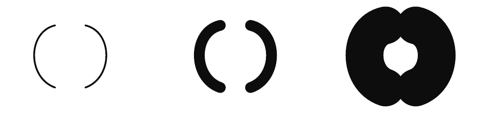
Fragile, readable and congested structural forms
A useful reduction
Remove incidental detail while retaining the identifying parts and the gesture that formed them. Recheck the silhouette. Simplification should preserve pressure changes and open intervals as well as meaning.
A useful limit
If a viewer can only recognise the motif from the application name or a large preview, its abstraction has gone too far. Recover a familiar contour or a decisive internal gap.
Material and structure
These diagrams isolate structural failure. They are schematic teaching aids, not templates for finished contours. Pages 05 and 27 show how brush movement generates the form; page 14 tests a brush import through the native renderer.
Too fragile / reject
Thin stroke bodies become unstable as the image shrinks.
Readable structure / preferred
The body and opening remain distinct without texture.
Too congested / reject
Heavy mass joins the strokes and closes their separating intervals.
R03 / B. R04-R05 / W. A successful large illustration does not establish a successful small app icon.Back to contents
10. The canvas is not the icon shape
The operating system supplies the enclosure. The artwork supplies the sign.
Raw square canvas / no system mask

iOS / iPadOS

macOS

watchOS

Source canvas → system mask
Prepare full square artwork: 1024 × 1024 for iOS/iPadOS/macOS; 1088 × 1088 for watchOS. Apple applies the rounded or circular mask. Avoid a second, hand-drawn outer enclosure that duplicates that system boundary. [S1]
A circle inside a rounded square
A circular motif or the Ergo octagon remains part of the foreground. It does not change the iOS or macOS outer mask. Preserve adequate white space between the emblem and the platform enclosure.
Optical fit
Use Apple’s current template and the actual rendered boundary. “Squircle” is useful shorthand, not a licence to replace the platform curve with an arbitrary corner radius. Check circular clipping at diagonal tips and equal perceived weight between platforms.
R13 / A. The native exports establish mask behaviour; the house grid on page 06 establishes a starting composition. Neither fixes one universal inset for every motif.Back to contents
11. One identity, six appearances
Use the same geometry while giving each system appearance a readable tonal hierarchy.
Default
Dark

Clear / Light

Clear / Dark

Tinted / Light

Tinted / Dark

Author the tonal basis
Icon Composer exposes Default, Dark and Mono settings. Mono informs clear and tinted treatments; these are not six unrelated drawings. Here the ink body stays identical while the renderer changes tone and surface. [S1, S2]
Respect the platform matrix
iOS, iPadOS and macOS support the appearance family illustrated here. Watch uses its circular default/light presentation; do not promise this six-mode matrix on watchOS. [S1, S6]
R08 / B. These are native renderer exports, not Home Screen captures. Clear and tinted behaviour must still be checked against real wallpapers and the supported OS version.Back to contents
12. Automatic is a starting point
A dark preview can preserve every contour and still lose the sign.
Automatic / weak contrast

Tuned / readable polarity
Observed failure
The left sign becomes a faint outline against a dark ground. A large preview still shows the geometry, but search and recognition become dependent on highlights.
Deliberate correction
Keep the same silhouette. Set a light foreground for Dark and a useful Mono basis; reduce effects that compete with the mark. The right study uses a light grey figure, a system dark background and no foreground glass.
Review the actual result
Check dark and tinted modes at small sizes and in context. Avoid pure black Watch backgrounds that merge with the launcher; Apple recommends an identifiable boundary there. [S1]
R08 / B. Tone changes are permitted by the brief. This correction is a teaching example, not a chosen dark design for any application.Back to contents
13. Liquid Glass is a material decision
Compare the ink body and its edge at the same scale, then inspect the same detail.
Matte ink
3× matched detail
01 Uniform ink body
02 Clean, unlit boundary
Native Liquid Glass

3× matched detail
01 Tonal surface modelling
02 Specular highlight along the rim
Layer and group
Layers hold the figure and wash. Groups control shared depth and effects. Here the same sign receives either a matte or glass foreground treatment. [S2, S3]
Read the surface
Specular highlights describe light on a surface; shadow separates depth. Translucency passes part of the background; refraction distorts it. Judge which effects actually remain visible. [S2]
House starting point
Begin with matte ink. Add restrained native glass only when it supports recognition.
R14 / W. Current documentation includes version-27 controls: refraction changes have no visible effect before 27, and separate inside/outside specular options behave as On before 27. Verify 26.6 behaviour in its actual toolchain. [S2]Back to contents
14. Texture needs room to breathe
A persuasive brush stroke can still fail when the system applies its mask.
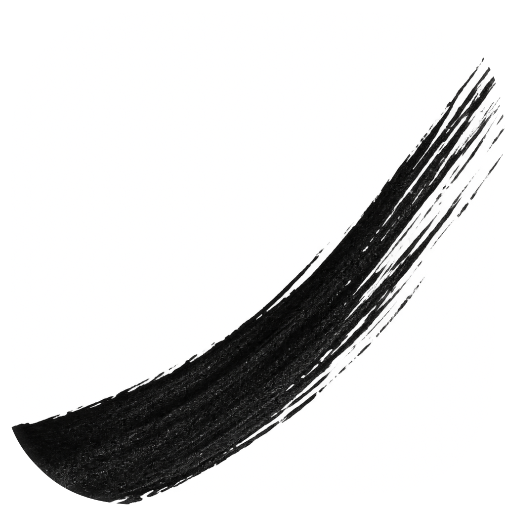
Matte / oversized
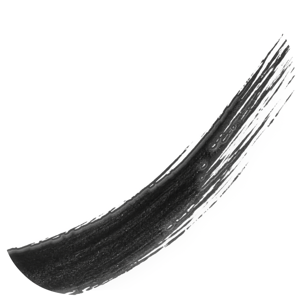
Glass / oversized
Watch / clipped
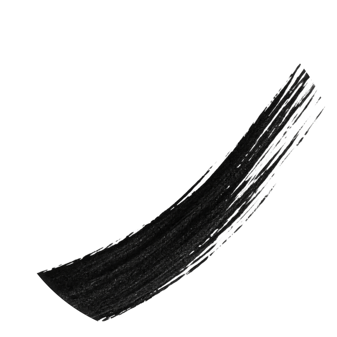
The mask exposes the error
The native import fills too much of the canvas. Both enclosures cut the ends; the circle removes more of the diagonal gesture. Reduce the placed layer scale and rebalance it in the native preview until the complete identifying contour has room.
What can fail
Soft fringes and low-alpha particles can become weak or artificially embossed under glass. Here the glass treatment also changes the texture’s apparent weight. Inspect edges on light and dark grounds; Apple recommends clearly defined foreground edges. [S1]
From study to controlled artwork
Use the image as a material reference. Construct the semantic silhouette deliberately, retain only useful grain, and check placement and small-size output again after every correction. The recognition anchor must survive even when the texture disappears.
R07 / B. R13 / A. R14 / W. This plate documents clipping and material response. The corrected placement belongs to a later controlled composition; no application-specific design is proposed.Back to contents
15. Points describe size. Pixels carry it.
A 32-point image can require 32, 64 or 96 pixels without changing its logical size.
32 pt × 1 = 32 px

32 pt × 2 = 64 px

32 pt × 3 = 96 px

The conversion
pixel width = logical width in points × scale factor. The scale label belongs to a slot or display context. A 32-pixel file is not automatically a 32-point icon on every device.
Platform density
Apple’s general bitmap guidance uses @2x/@3x for iOS, @2x for iPadOS and watchOS, and @1x/@2x for macOS. This is density guidance, not a mandatory list of every app-icon export. [S7]
Resolution is not print DPI
Pixels specify the image grid; ppi describes how densely those pixels are placed on paper. Writing “300 dpi” into an image does not create missing screen detail or satisfy a target slot.
R15 / A. Dimensions here are a controlled density demonstration, not Home Screen slot specifications. Resolve actual icon roles through the project, catalog and Xcode build.Back to contents
16. Inspect the raster, not just the master
Vector curves describe geometry. A bitmap resolves that geometry onto a finite grid.
Outlined structure / 32 px

Brush material / 32 px

Antialiasing
Intermediate edge pixels smooth a curve. They are not unnecessary grey noise. Aggressive thresholding, repeated resizing and sharpening can destroy a gap or create a halo.
Working correction
Inspect at 1:1 as well as enlarged. If a critical opening collapses, widen it or simplify the contour in the controlled source, then render again. A 2-pixel opening at 32 pixels is a starting test, not a guarantee.
Pixel delivery
Keep alpha for foreground layers and lossless PNG for raster proofs. Use one intentional final rasterisation per output. Do not enlarge a tiny finished icon to make the 1024-pixel master; do not use JPEG compression for these edges.
R16 / W. A rendered preview may be transparent outside the system mask. This does not permit a transparent background layer in the original full-bleed icon artwork. [S1, S2]Back to contents
17. A sign lives among other signs
Recognition depends on its surroundings, visible size and neighbours.
Schematic phone, Watch and Dock contexts with native proof icons
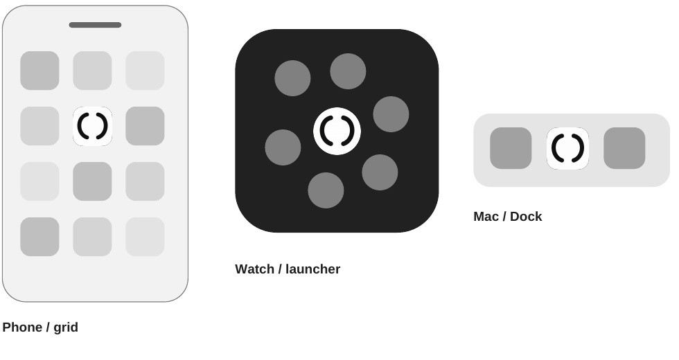
Home Screen
Compare visual weight, negative space and dark/light polarity beside other rounded icons. Test the available icon sizes and clear/tinted modes against real light, dark and busy wallpapers.
Watch launcher
Read the sign in a dense field of circles. Keep essential features away from clipped corners; check the actual device and launcher scale. A circular motif alone does not distinguish the application.
macOS Dock and search
Inspect small Dock sizes, magnification and search/Settings placements. Avoid relying on grain, hairline borders or micro-badges. Record the context, OS and visible size with each issue.
R11 / B. Native export evidence and schematic context are separate. App-specific simulator and physical-device captures belong to the later platform-proof stage.Back to contents
18. From master to target output
Choose the source route per target, then verify what the build actually delivers.
1 / Prepare the master
Keep an opaque, full-bleed background separate from transparent ink and optional wash. Preserve the approved raster original and alpha. Use editable vector contours only when they retain the gesture. Do not pre-round the source or paint glass reflections into it. [S1, S2]
2 / Configure native material
Import the layers into Icon Composer. Tune Default, Dark and Mono, group depth, shadow and Liquid Glass. Inspect the actual imported silhouette: a stroked SVG can render differently from an explicitly outlined path.
3 / Build the chosen route
The .icon route lets Xcode render target sizes and supported older appearances. It replaces the app-icon asset catalog. If an older OS must retain a different design, evaluate the catalog route for that target. Keep the deployment minimum unchanged. [S2, S8]
4 / Verify the delivery
Match the build result to a per-target resolution ledger: platform, role, points, scale, pixel dimensions, mode, source revision and output. Confirm the archived application uses the reviewed icon. Native preview PNGs alone are not an integration check.
| Platform | Source canvas | Masking |
|---|---|---|
| iOS / iPadOS / macOS | 1024 x 1024 | Square artwork; system-applied rounded masking. |
| watchOS | 1088 x 1088 | Square artwork; system-applied circular masking. |
R09 / A. 1024 and 1088 describe current source canvases. They do not require manually drawing every rendition. Legacy catalog slots and their 1024-pixel Watch marketing image are a separate output contract.Back to contents
19. Make every output accountable
A target ledger turns “all resolutions” into a checkable delivery contract.
Read the table correctly
These are checked-in catalog examples from the named projects, not a universal or guaranteed-current Apple size list. The Watch companion Settings @3x slot belongs to the iPhone context. The current .icon source uses a 1088-pixel Watch canvas. [S1, S5]
Record and validate
The source package includes the exact catalog rows, a resolution-ledger template and native exports from 16 to 1088 pixels. At integration, derive the full required list for each active target, compare file dimensions and appearances, and record build/device evidence.
| Project / role | Logical size or source | Scale | Pixels |
|---|---|---|---|
| Pivot / macOS | 16, 32, 128, 256, 512 pt | @1x and @2x | 16-1024 px |
| ErgoWallet / iOS | Universal catalog source | 1024 px source | Build-resolved |
| GravityMaze / Watch | Notification 24 / 27.5 pt | @2x | 48 / 55 px |
| GravityMaze / Watch | Launcher 40 / 44 / 46 / 50 / 51 / 54 pt | @2x | 80 / 88 / 92 / 100 / 102 / 108 px |
| GravityMaze / Watch | Quick Look 86 / 98 / 108 pt | @2x | 172 / 196 / 216 px |
| GravityMaze / companion | Settings 29 pt | @2x / @3x | 58 / 87 px |
| GravityMaze / marketing | Legacy Watch catalog | @1x | 1024 px |
R17 / B. A slot declaration proves an expected size, not that an existing PNG is correct or the current build uses that catalog. No app build or deployment target was changed for this edition.Back to contents
20. Fifteen projects, distinct identities
This map records recognition questions and candidate anchors, not selected designs.
| Project | Current surface | Recognition brief |
|---|---|---|
| ergometal | macOS CLI | Compact octagon with Sigma and internal register rhythm; computation stays inside. |
| gravitymaze | Watch | A ball and traversable maze; keep distinct from a racing road. |
| MorseRelay | iPhone + Watch | Readable dit / dah rhythm and transfer; preserve meaningful timing cues. |
| blackboard | Web library | A writing gesture and chalk context; avoid resemblance to a maze. |
| ergowallet | iPhone | Recognisable custody / wallet cue; resolve Ergo relationship and three states. |
| gravityswarm | Watch | A leading body and followers; collective motion should remain visible. |
| watchwinder | iPhone + Watch | Winding motion and recorded movement; distinguish simple timekeeping. |
| lacon | Python tool | A legal citation relationship; establish a shared Lacon anchor. |
| pivot | iPhone / iPad / Mac | Movement between positions around a stable reference. |
| whisper | iPhone + Watch | Local speech-to-text; distinguish it from a generic audio recorder. |
| clockify | Python CLI | Time entries and summaries; identify this tool rather than imply the provider app. |
| lacon-app | iPhone / iPad / Mac | Legal-reference graph; related to Lacon with clear application identity. |
| dogfight | Watch | Two reduced flight gestures and opposing movement; retain a wing-axis cue. |
| gravitydigits | Watch | Readable numeral obstacle, irregular particles and visible boundary deflection. |
| tiltracer | Watch | Road bend, direction and steering; distinguish GravityMaze. |
Repository inventory checked on 11 September 2026. Eleven projects contain Icon Composer packages; four have separate project graphics. Repo names are used here for traceability. Product names and motifs remain subject to the individual brief.Back to contents
21. Judge it at the size of use
A small, flat-black check exposes weaknesses that a large textured image can hide.
16 px

24 px

32 px

48 px

64 px

128 px

Record evidence
For every candidate, record file version, device or simulator, OS, appearance, display size and observed issue. Treat simulator checks and physical-device checks as separate evidence.
Recognition
The chosen emblem, object or behaviour remains legible; essential gaps stay open.
Differentiation
Each app expresses its own role and remains distinct from ecosystem marks and sibling apps.
Material
Pressure and direction remain visible in the broad shape after fine grain disappears. Essential meaning and behavioural cues survive reduction.
Framing
Key content survives the rounded square on iOS/iPadOS/macOS and the circular watchOS mask.
Appearance
The identity holds across the supported appearance modes and wallpapers.
Context
Review Home Screen, Watch launcher, Dock and relevant Settings / search placements.
R11, R18-R19, R21-R22 / B. Native exports support review; they do not establish audience recognition, every target size or physical-device behaviour. Record limits rather than assuming a pass.Back to contents
22. From study to application
Each stage has an explicit output and a defined review question.
01 / Anchor brief
Choose emblem, object or behaviour. Record its minimum features, app purpose and nearest confusion.
What must remain recognisable?
02 / Controlled studies
Explore meaning and brush course together. Test pressure, lifted ends and deliberate asymmetry against the minimum recognition features.
How much change can the anchor support?
03 / Family comparison
Compare silhouette, mass, gaps and app-level differences across the complete set.
Does the family stay coherent and distinct?
04 / Master artwork
Preserve the selected raster original, layers and placement. Vector reconstruction is optional and must retain the hand. Record every optical correction.
Can the approved result be reproduced?
05 / Platform proof
Build target outputs and inspect supported modes, masks and small sizes.
Does it work in the actual system?
06 / Integration
Replace the named assets after design acceptance; build and record the changed targets.
Back to contentsDoes the application ship the reviewed artwork?
R10 / B. Retain selected pixels, prompts, rights-holder metadata and decisions. Design approval precedes replacement of named repository assets. A prompt cannot reproduce identical pixels.
23. An edition that can evolve
Keep decisions, examples and implementation evidence traceable across revisions.
Version policy
0.x denotes a working standard; 1.0.0 marks acceptance. Major revisions change the visual contract; minor revisions extend guidance. At the owner’s requested version number, 0.4.1 clarifies the original Sumi-e intent: the gesture shapes the form itself.
Stable references
Keep R01-R22 and F01-F17 stable. Earlier teaching figures retain their IDs. F15-F17 add handwriting, family and wallet-state comparisons. Artwork and target manifests keep separate versions.
Editable source
editorial.json, rules.json and edition.json define the edition. Retained PNGs, .icon teaching packages, prompts, export arguments and hashes preserve the evidence. The PDF rebuild reads frozen images; optional native regeneration requires the recorded macOS tool.
Print setup
A4 portrait, 210 x 297 mm; 30 pages. Print at 100%, with long-edge duplex if desired. Main text has 20 mm side margins; no bleed. Fonts are embedded. Small raster samples are intentionally enlarged for analysis.
Proof boundary
Use grayscale for the monochrome proof and a colour proof for the tinted examples. Screen hex values and K-only ink proofs are separate starting points. This is a general print PDF, not a certified PDF/X separation. Device pixels and print ppi answer different questions.
Revision 0.4.1 / 13 September 2026. Clarifies brush handwriting throughout the standard and records a selective family revision. Earlier editions remain preserved.Back to contents
24. Sources and decision record
Platform facts are sourced. Design rules are identified as project decisions.
S1 / Apple / App icons
Platform masks, canvas sizes, edge guidance and appearance consistency.
S2 / Apple / Creating your app icon using Icon Composer
Layer preparation, material controls, generated sizes and older-system behaviour.
Apple / Creating your app icon using Icon Composer
S3 / Apple / Create icons with Icon Composer
Additional workflow reference.
Apple / Create icons with Icon Composer
S4 / Project brief and clarification
Sumi-e, familiar anchors, Apple appearances, English A4, application purpose, behavioural recognition, gekko copyright and the accepted handwriting clarification.
Project brief / 11-13 September 2026
S5 / Local project inventory
README files, target settings, current .icon packages and vector artwork. Inventory date: 11 September 2026.
Fifteen named repositories under ~/Developer
S6 / Apple / Say hello to the new look of app icons
Appearance family and Apple Watch presentation.
Apple / Say hello to the new look of app icons
S7 / Apple / Images
Logical size, bitmap resolution and scale factors.
S8 / Apple / Configuring your app icon
Catalog-based app-icon configuration.
Apple / Configuring your app icon
S9 / Native rendering record
Icon Composer 1.6 (99.1), Xcode 26.6 (17F113); frozen export arguments, file dimensions and hashes. No device captures.
Source package / native-render-log.json
D01-D04 / Recognition anchors; monochrome default with adaptive tones; provisional parameters; educational scope.
D05 / Show native platform masks and surface behaviour. Keep source, renderer proof and device validation distinct.
Apple sources checked 11 September 2026; design decisions extended 13 September. The Sigma/octagon diagram is not an official master. Additional museum references and the handwriting interpretation appear on page 27.Back to contents
25. Choose what carries recognition
Three corrected directions apply the same ink language to different kinds of meaning.
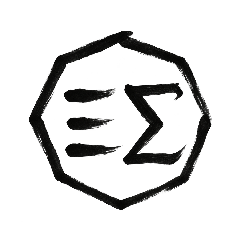
EM-04 / computation
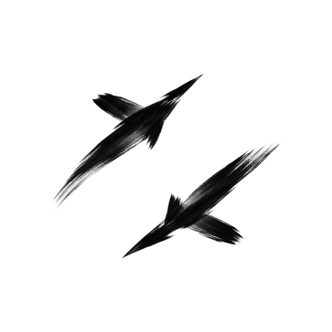
DF-02 / encounter
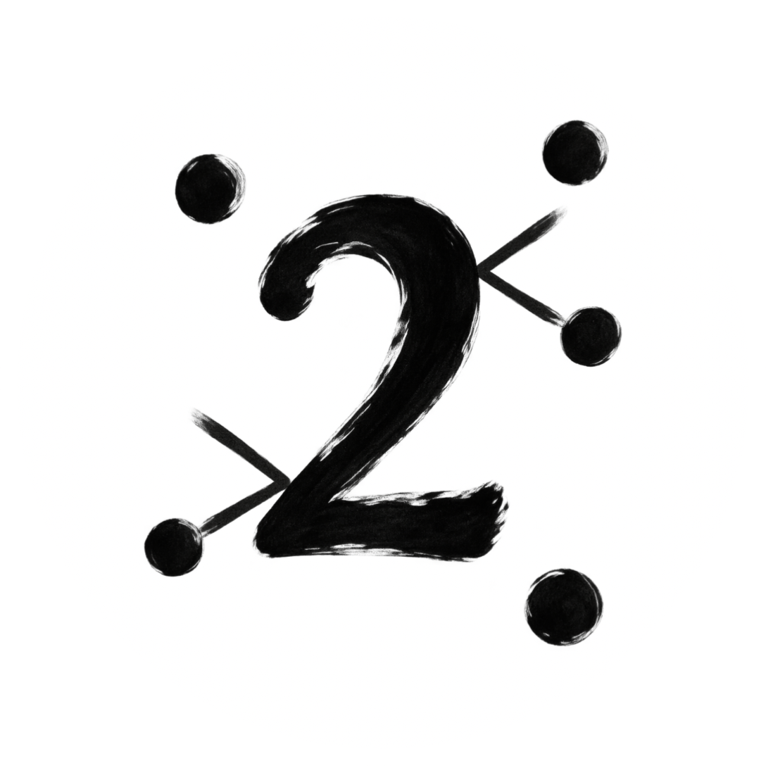
GD-05 / collision
Computation inside the signet
ErgoMetal R2 extended the process horizontally. EM-04 keeps three register strokes and Sigma within one octagon, continuing EM-03 with a personal brush hand. The compact whole and open gaps take priority over a literal process diagram.
Object reduced to action
Dogfight R1 was too illustrative. Two angular flight gestures, a minimal wing-axis cue and opposing headings carry the encounter. The negative space between them expresses the turn.
Behaviour made visible
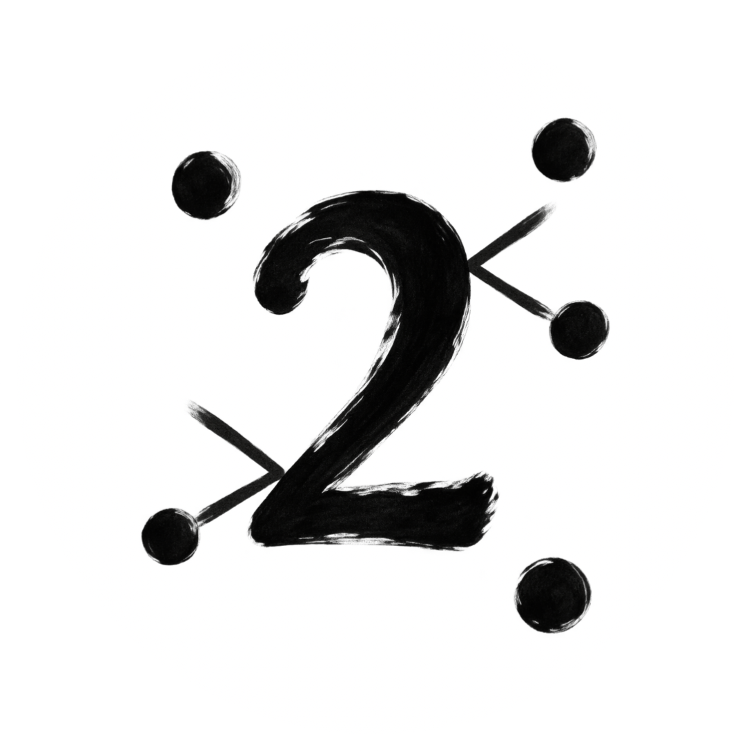
GravityDigits R1 arranged points like punctuation. The revision uses irregular placement and visible directional changes at a numeral boundary. The interaction must be readable without a caption.
R18-R20 / B. Review meaning first, then the mask and raster. The computational cue must fit inside the signet without competing with the Sigma or the octagonal contour.Back to contents
26. Copyright and decision record
The edition names its rights holder and keeps design decisions separate from production approval.
Copyright holder
gekko
© 2026 gekko
Notice placement
Carry the copyright notice in the edition colophon, metadata and source-package documentation. Keep icon artwork free from copyright text, signatures, watermarks and decorative labels.
Reference attribution
Ecosystem marks, museum references, Apple documentation and the bundled typefaces retain their separate source credits. The gekko notice does not replace those attributions.
D06 / Recognition levels
Choose an emblem, object or behaviour as the primary anchor. App identity must add its own meaning; changing material alone is insufficient.
D07 / Three revision briefs
ErgoMetal: show computation and mining context. Dogfight: reduce aircraft anatomy to flight gestures. GravityDigits: show irregular motion and deflection at numeral boundaries.
D08 / Copyright record
The user identified gekko as copyright holder on 12 September 2026. This edition records that name exactly; no expanded legal entity name is inferred.
D09 / Compact computation
ErgoMetal must remain a compact signet. Its computational cue belongs inside the octagon; three register strokes and the Sigma replace the externally extended R2 process.
D10 / The hand carries the form
The accepted clarification makes pressure, direction and lifting structural. Slightly unequal sides and individual starts and ends are part of the design, not faults to remove.
Review boundary
Current studies await selection. Optical preparation, target outputs and device evidence belong to integration. Preserve the selected brush character. Existing application artwork remains unchanged until approval.
Edition 0.4.1 / 13 September 2026. Copyright holder: gekko. HTML and PDF share the editorial source. Project assets require approval before replacement.Back to contents
27. The hand carries the form
A recognisable sign can be written freely. Accuracy of meaning does not require geometrical exactitude.
EM-03 / regular construction

EM-04 / pressure and lift
Gesture
Let contact, loading, direction, overlap and lift generate the contour. A perfect vector with a distressed edge cannot supply that structural movement.
Recognition
Keep identifying relationships: enclosure, orientation, separation and the app’s operation. Allow unequal sides and strokes where those relationships remain clear.
Interpretation
The brief invokes Matisse’s “exactitude is not truth”. Here it supports expressive fidelity. This is a project interpretation, not a claim that Matisse founded or defined Sumi-e. [S10, S11]
S10 / The Met / Brush Writing in the Arts of Japan
Pressure, speed and rhythm give brush writing its individual character. Accessed 13 September 2026.
The Met / Brush Writing in the Arts of Japan
S11 / Hammer / Exactitude is Not Truth: Matisse Breaks Through
Museum programme, 11 January 2026; context for the brief’s Matisse principle. Accessed 13 September 2026.
Hammer / Exactitude is Not Truth: Matisse Breaks Through
R21-R22 / B. Personal handwriting describes the treatment of the sign; it does not permit a signature, seal or extra lettering.Back to contents
28. One hand, different signs
Shared pressure and generous intervals connect the family. Each application keeps its own meaning and silhouette.
ErgoMetal / EM-04 / Redraw
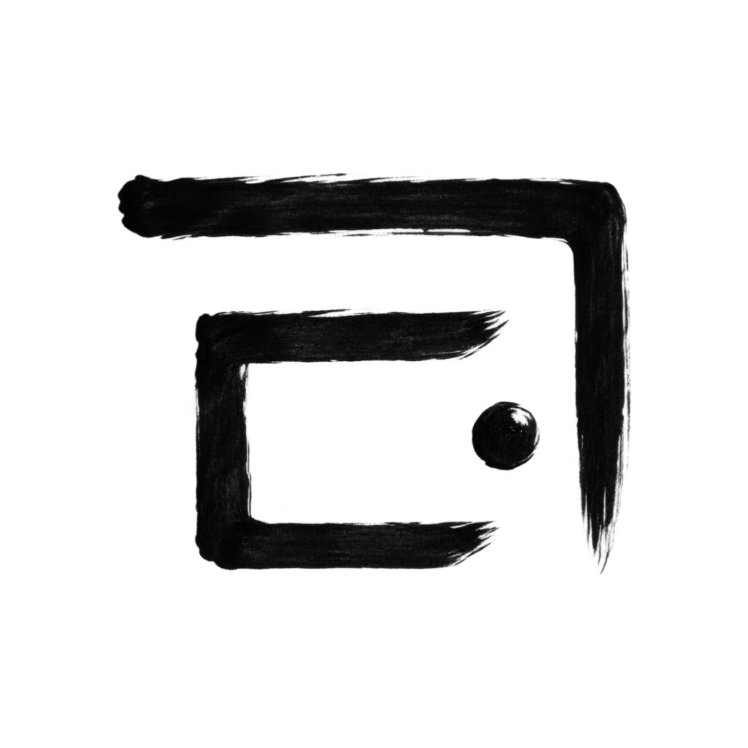
GravityMaze / GM-02 / Redraw
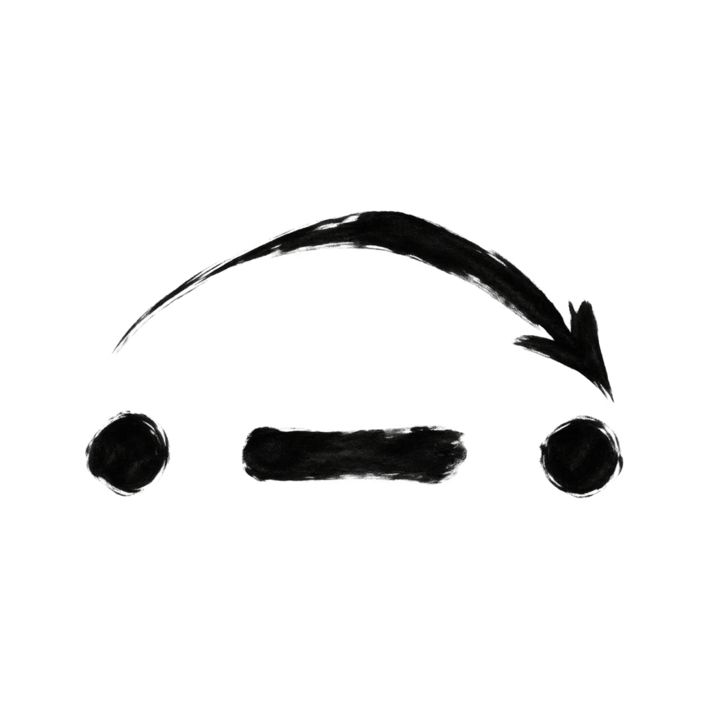
MorseRelay / MR-02 / Redraw
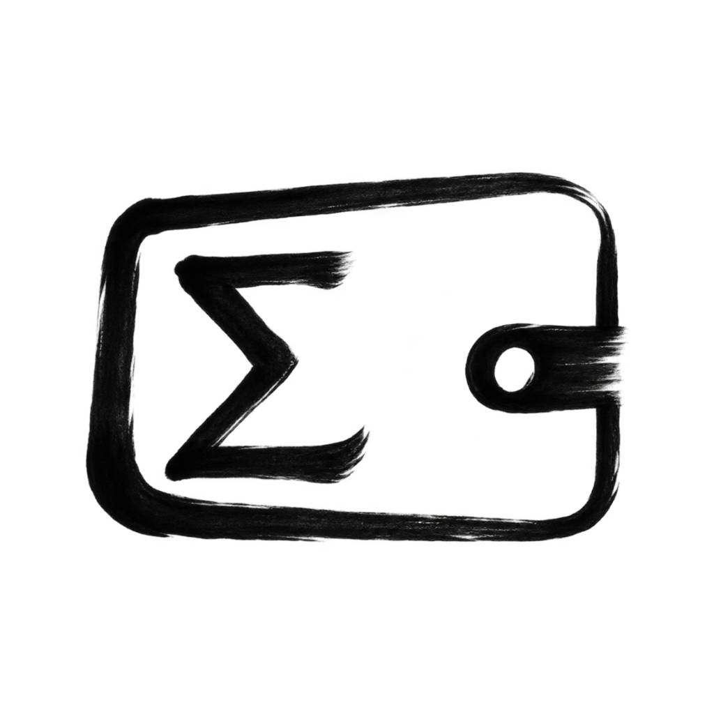
ErgoWallet / EW-M02 / Redraw
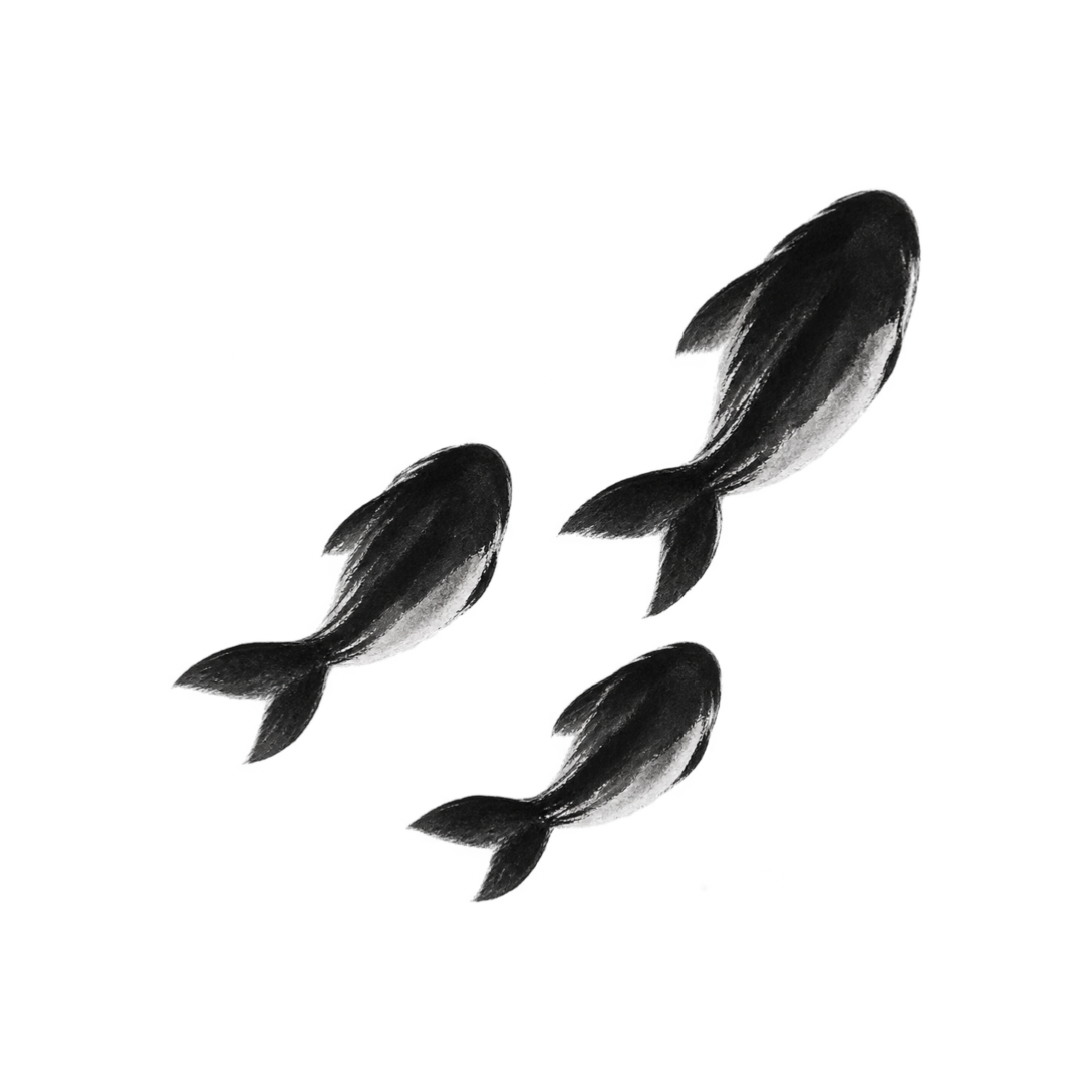
GravitySwarm / GS-02 / Retain
WatchWinder / WW-02 / Redraw
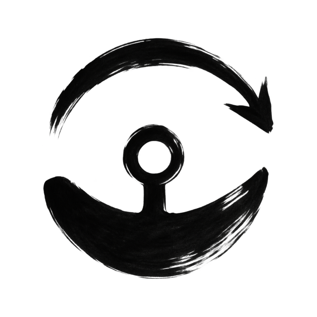
Lacon / linker / LC-02 / Redraw
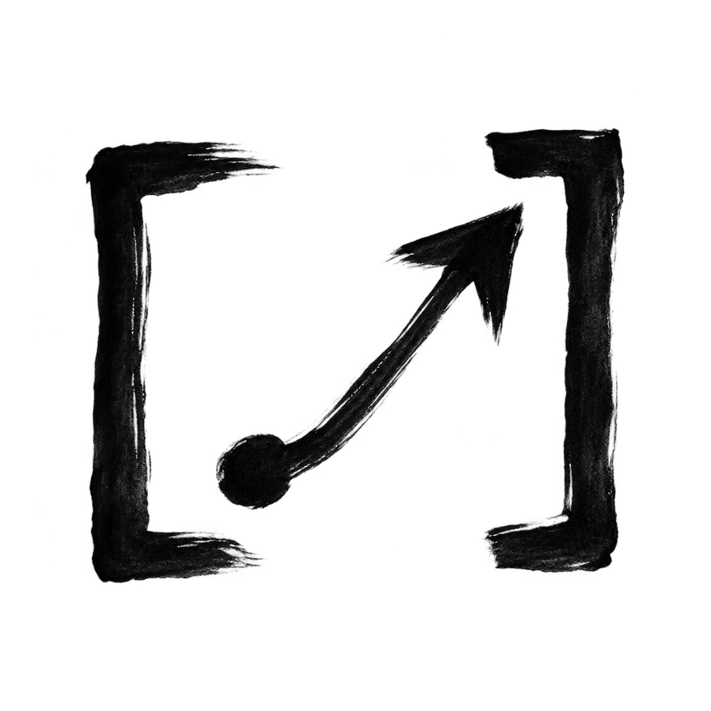
Pivot / PV-02 / Retain
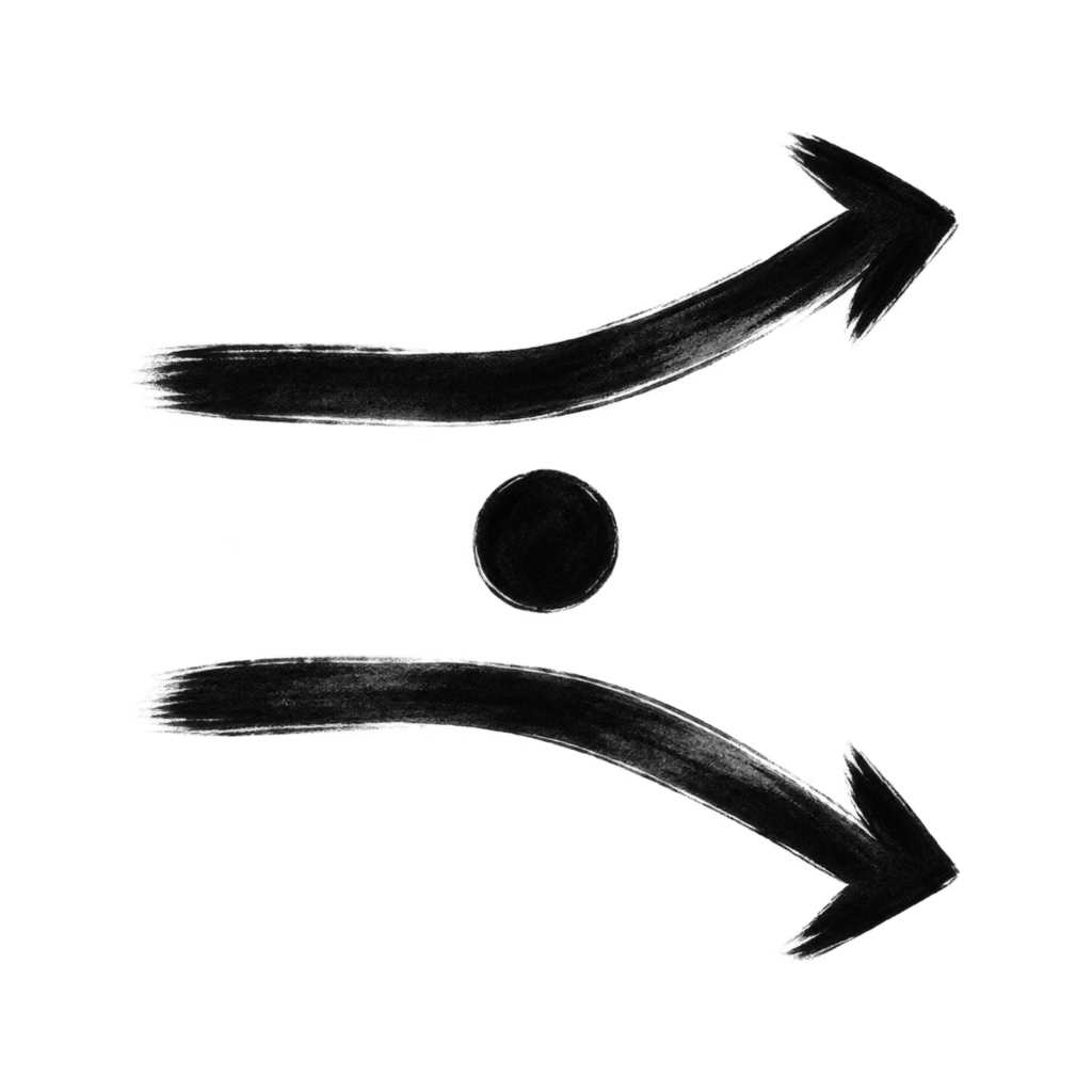
Lacon / graph / LA-02 / Redraw
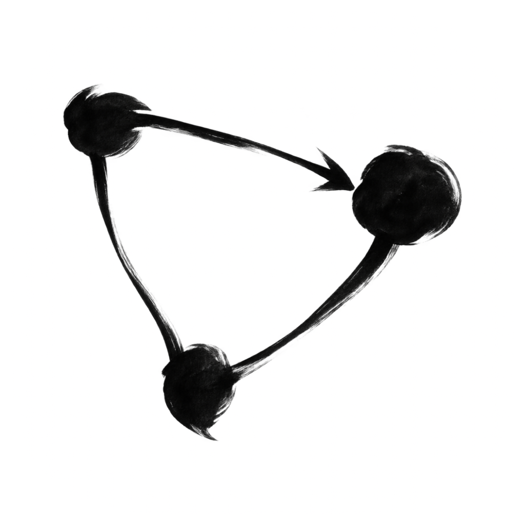
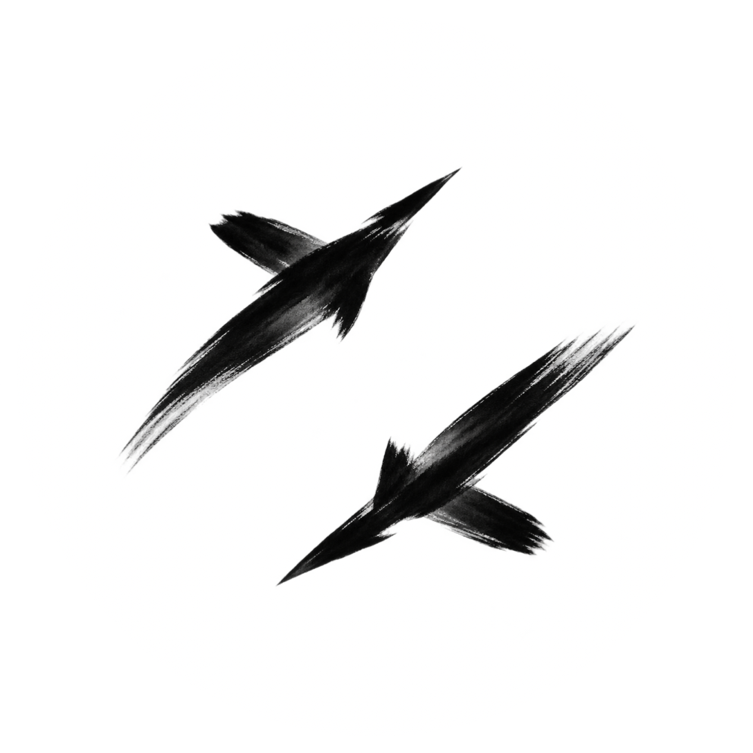
Dogfight / DF-02 / Retain
GravityDigits / GD-05 / Retain
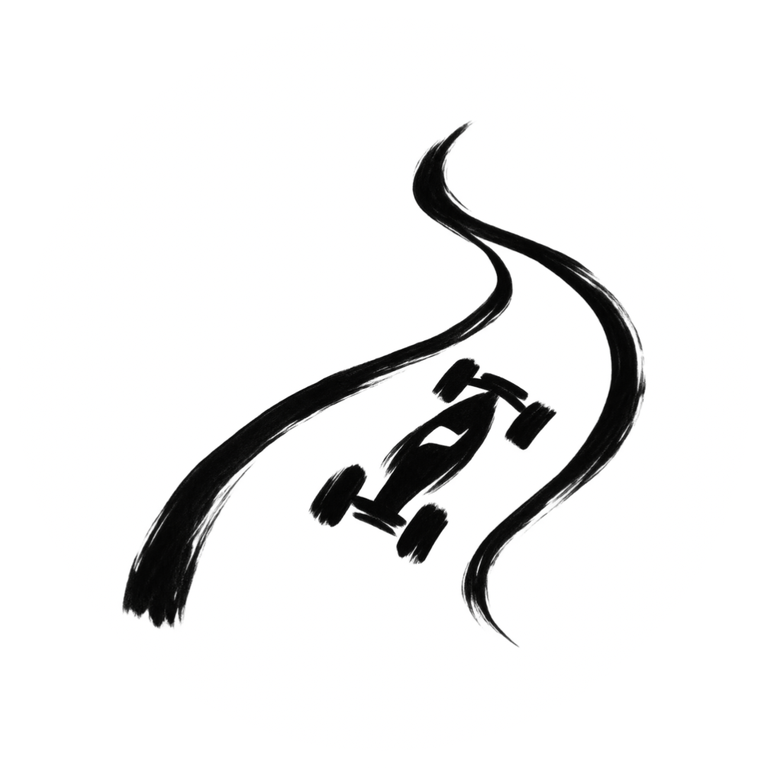
TiltRacer / TR-02 / Redraw
This is a family comparison, not a release approval. Platform masks are native previews; Home Screen, launcher and Dock behaviour still require integration evidence.Back to contents
29. Meanings survive the variants
ErgoWallet keeps one brush family and three visible state cues. Meaning cannot depend on colour alone.
Mainnet / one fastening
Testnet / two fastenings
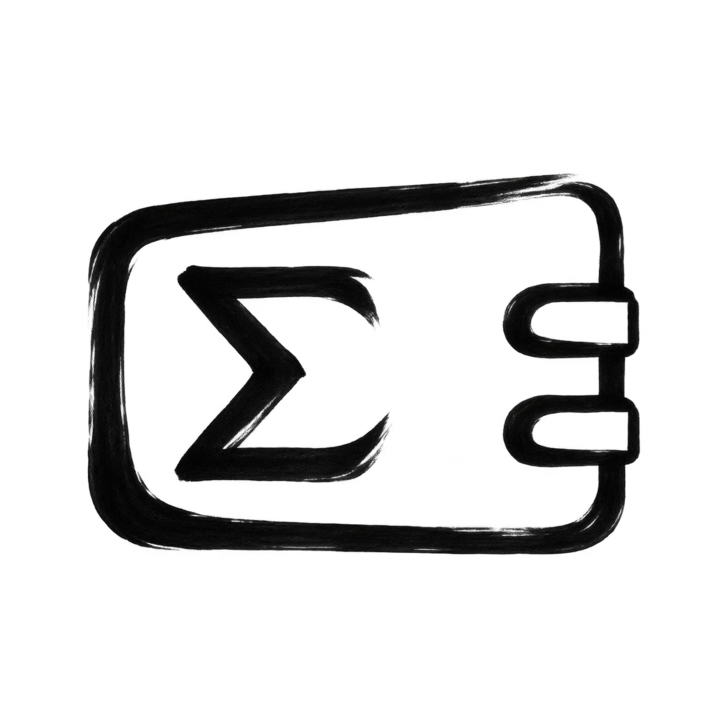
Cold / closed padlock
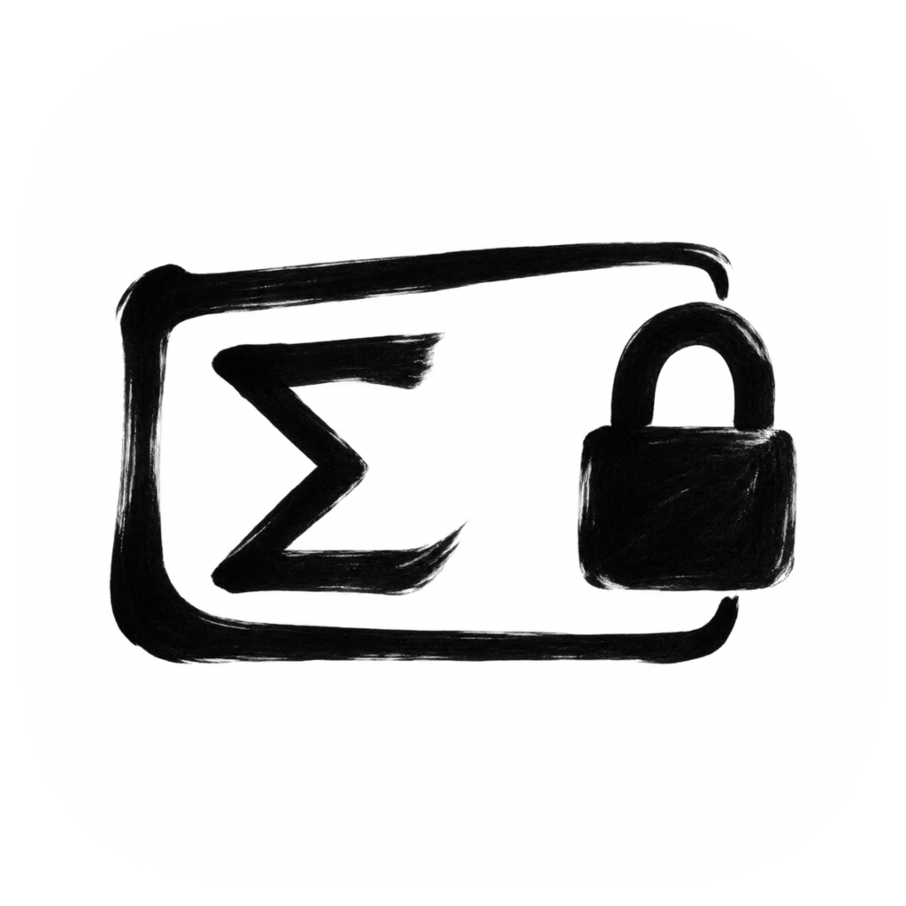
Shared hand
Vary pressure within each frame and Sigma. Corresponding parts need related weight and spacing; they need not be mechanically identical.
Distinct cues
One fastening identifies Mainnet, two identify Testnet, and the closed padlock identifies Cold. Keep the two fastenings separate and the padlock opening visible.
Size and appearance
Compare 32- and 64-pixel exports, then the actual target sizes. Preserve cue separation in Dark, Clear and Tinted previews. A small icon must not replace explicit target labels in the app.
Approval boundary
These are visual identity studies. They do not change Mainnet gates, security behaviour or software configuration. Review their shape cues before replacing any target artwork.
R01-R03, R08, R21-R22 / B. Frozen raster originals, generation prompts, native wrappers and review outputs are retained in the companion family source package.Back to contents
30. Record every decision
Fourteen marks were reviewed individually. Redrawing is justified by a weakness in the form, not by a demand for uniform novelty.
D11 / Selective revision
Ten redrawn marks and four retained originals. The retained master files remain byte-identical. Earlier editions and candidates are preserved; no application repository artwork is replaced by this edition.
| Project / state | Previous → current | Action | Reason |
|---|---|---|---|
| ErgoMetal | EM-03 → EM-04 | Redraw | Pressure-led enclosure and registers |
| GravityMaze | GM-01 → GM-02 | Redraw | Nested walls with a written turn |
| MorseRelay | MR-01 → MR-02 | Redraw | Separate dabs and a transfer gesture |
| ErgoWallet | EW-M01 → EW-M02 | Redraw | Handwritten frame, Sigma and clasp |
| GravitySwarm | GS-02 | Retain | Loaded bodies and taper already work |
| WatchWinder | WW-01 → WW-02 | Redraw | Unequal rotor and winding gesture |
| Lacon / linker | LC-01 → LC-02 | Redraw | Independent bracket and link strokes |
| Pivot | PV-02 | Retain | Existing paths already carry pressure |
| Lacon / graph | LA-01 → LA-02 | Redraw | Uneven nodes and connection rhythm |
| Dogfight | DF-02 | Retain | Existing flight gestures already work |
| GravityDigits | GD-05 | Retain | Preserve numeral and collision contacts |
| TiltRacer | TR-01 → TR-02 | Redraw | Replace the precise miniature car |
| ErgoWallet Testnet | EW-T01 → EW-T02 | Redraw | Carry the hand into two fastenings |
| ErgoWallet Cold | EW-C01 → EW-C02 | Redraw | Carry the hand into the closed lock |
Audit date: 13 September 2026. Candidate identifiers track drawings, not shipped app versions. The source package records selected pixels, rejected attempts, prompts, dimensions and hashes.Back to contents
31. Rule register
R01 / Preserve the recognition anchor
Identify the emblem, object or behaviour that establishes recognition. Preserve its essential relationships, openings and action; exact equality, symmetry and ruler-straight contours are not universal requirements.
Class B / PDF pages 03, 04, 08, 25
R02 / Differentiate the application
An application must express its own purpose beyond a shared ecosystem sign. Brush texture, colour and tiny badges alone do not establish sufficient distinction.
Class B / PDF pages 03, 08, 20, 25
R03 / Protect small-size structure
The essential silhouette and openings must survive reduction without material detail.
Class B / PDF pages 03, 09, 16, 21
R04 / Limit dominant gestures
Start with two to four dominant gestures. Reduce familiar objects to the minimum features that carry identity; add detail only when it contributes necessary meaning.
Class W / PDF pages 05, 09
R05 / Design active negative space
Use a 100-unit grid for placement, about 12-unit inset and a 6.25-unit critical gap for initial 32-pixel tests. Validate the raster; the grid must not dictate or straighten the brush path.
Class W / PDF pages 06, 09
R06 / Keep the default monochrome
Black ink and restrained grey on white; system appearance adaptation may alter tone or apply user tint.
Class B / PDF pages 07, 11
R07 / Keep material subordinate
Texture and wash may disappear without removing identity; keep the paper quiet.
Class B / PDF pages 05, 07
R08 / Preserve identity across appearances
Retain identifying relationships and the selected brush course while tuning the tonal hierarchy for actual supported modes.
Class B / PDF pages 11, 12
R09 / Respect the platform output contract
Use target-appropriate unmasked artwork, source canvases and build-generated outputs; verify current Apple guidance.
Class A / PDF pages 18, 19
R10 / Retain controlled sources
Preserve editable masters, raster sources, layers, prompts, rights-holder metadata and versioned review decisions.
Class B / PDF pages 22, 23, 26
R11 / Record validation evidence
Keep size, mode, OS and device evidence separate from illustrative previews.
Class B / PDF pages 17, 21
R12 / Exclude extraneous marks
No watermarks, signatures, seals, emojis or self-referential marks; avoid decorative labels in icons.
Class B / PDF pages 02
R13 / Separate canvas and mask
Use unmasked square source artwork. Respect the rounded square on iOS/iPadOS/macOS and the circle on watchOS.
Class A / PDF pages 06, 10
R14 / Control native material
Start with a matte essential ink layer. Add native glass only when silhouette, intervals and tone remain clear; verify the actual OS behaviour.
Class W / PDF pages 13, 14
R15 / Resolve points into pixels
Compute output pixels from logical points and slot scale; do not substitute print DPI or a generic size ladder for the target contract.
Class A / PDF pages 15, 19
R16 / Review the final raster
Inspect each required small output at 1:1 and enlarged. Correct fragile contours in the controlled source and preserve clean alpha and antialiasing.
Class W / PDF pages 16
R17 / Keep a target resolution ledger
Record every active target, role, scale, dimensions, appearance, source version and build output; distinguish catalog expectations from validated delivered files.
Class B / PDF pages 18, 19
R18 / Choose the recognition level
State whether an emblem, object or behaviour carries recognition. Judge the design against that meaning and the application purpose before judging surface treatment.
Class B / PDF pages 03, 04, 25, 26
R19 / Show the causal relationship
When interaction is the defining feature, show where objects meet and how direction changes. Irregular spacing alone suggests disorder but does not establish collision. Preserve a visible causal cue at the intended size.
Class B / PDF pages 04, 21, 25, 26
R20 / Contain the process in the signet
For ErgoMetal, keep one compact octagonal enclosure with Sigma and the computational register rhythm inside it. Preserve internal gaps. Omit external inputs, result blocks and circuit detail. Eight recognisable turns do not require eight mechanically equal sides.
Class B / PDF pages 08, 25, 27
R21 / Let brush movement shape the form
Build the visible contour through loading, pressure, direction, overlap and lift. Preserve purposeful differences in width, angle, starts and ends. Surface grain applied to rigid geometry is insufficient; incidental distress and extra splatter are not substitutes.
Class B / PDF pages 03, 05, 27-30
R22 / Preserve the hand during optical correction
Enlarge a critical gap or strengthen a fragile core only as needed for recognition and raster clarity. Retain pressure changes, direction and deliberate asymmetry. Keep the original raster, record revised candidates and compare them at actual output size before acceptance.
Class B / PDF pages 06, 08, 21-22, 27-30Back to contents